There's just something about grey
Grey is defined as the following by The American Heritage Dictionary:
- adjective Of or relating to an achromatic color of any lightness between the extremes of black and white.
- adjective Dull or dark.
- adjective Lacking in cheer; gloomy
The Wikipedia article for grey has the following to say about the colour:
In America and Europe, grey is one of the least popular colours; In a European survey, only one per cent of men said it was their favourite colour, and thirteen per cent called it their least favourite colour; the response from women was almost the same. According to one author, “grey is too weak to be considered masculine, but too menacing to be considered a feminine colour. It is neither warm nor cold, neither material or spiritual. With grey, nothing seems to be decided.”[1] It also denotes undefinedness and ambiguity, as in a grey area.
I’ve never felt that grey was somehow the colour that is lacking[2]. Instead, I find it oddly comforting and aesthetic. It symbolizes a great blend of simplicity and openness to interpretation.
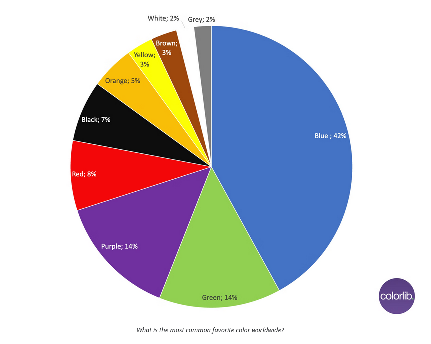
As a kid, my favourite colour was always blue. When I chose which university to go to, the colour of UBC’s blue (HEX #002145) played a non-zeo role in my decision (the other contender was the University of Toronto, which also has blue as the primary colour). I wasn’t alone, if you met a random person of the street, chances are that their favourite colour would be blue as well (figure below)[3]
I’m not sure exactly when my favourite colour switched to grey. It might have been 7 years or so years ago when I switched to a wardrobe of grey t-shirts (fun fact, this is why my cartoon profile picture, is in a grey t-shirt!)[4]. I really like grey in interior design, in opposition to the pushback against millenial grey. It’s not that I want everything to be grey, or even the same shade of grey, but I do enjoy a good majority of things to be grey with colour sprinkled in. This also creates a nice contrast with nature, looking out the window feels more spectacular when contrasted with a grey interior.
Colour as information
One limitation of greyscale and the reduction of colour is that colour communicates important information, often without us consciously thinking about it. Red or yellow usually means danger, green can mean something has succeeded. Here in Canada, our money is coloured which enables you to easily tell bills apart. When coding, colour is really helpful in telling different elements apart, and communicating meta information like git status.

Photo by PiggyBank on Unsplash. Used under the Unsplash license
Perhaps this is why I find grey so calming, it is the absence of that communication. It represents a reduction in the noise of everyday life, making the important things stand out. Grey doesn’t shout, it listens.
The new blog colourscheme
If you’re reading this post, the colourscheme of the blog has changed along with it! Previously I followed the Catppuccin colour palette, however, decided to give grey a whirl to more accurately reflect my colour preferences. Using grey should also make implementing a light and dark mode easier (just going to have light at launch). The one colour used is a deep blue for links and headers, to play homage to the history of my favourite colours over time.
Eva Heller, Psychologie de la couleur, effets et symboliques. (Pg. 226). Citation carried over from Wikipedia original. ↩︎
The debate rages on about whether grey should be considered a colour (and many point this out when I mention it is my favourite). Check out this site for an interesting presentation of arguments for and against. ↩︎
https://colorlib.com/wp/color-psychology-facts/ ↩︎
I cycle between 5-10 t-shirts, usually trying to get exact copies from the same brand when a sale is on. My current stock consists of this one from national standards, a local shop here in Vancouver. ↩︎